R4 브랜딩
쌀로 만든 맥주!!?
Rice Lager
Strategy
- - Brand Strategy
- - Art Direction
Branding
- - Logo
- - Packaging
- - Illustration
- - Application
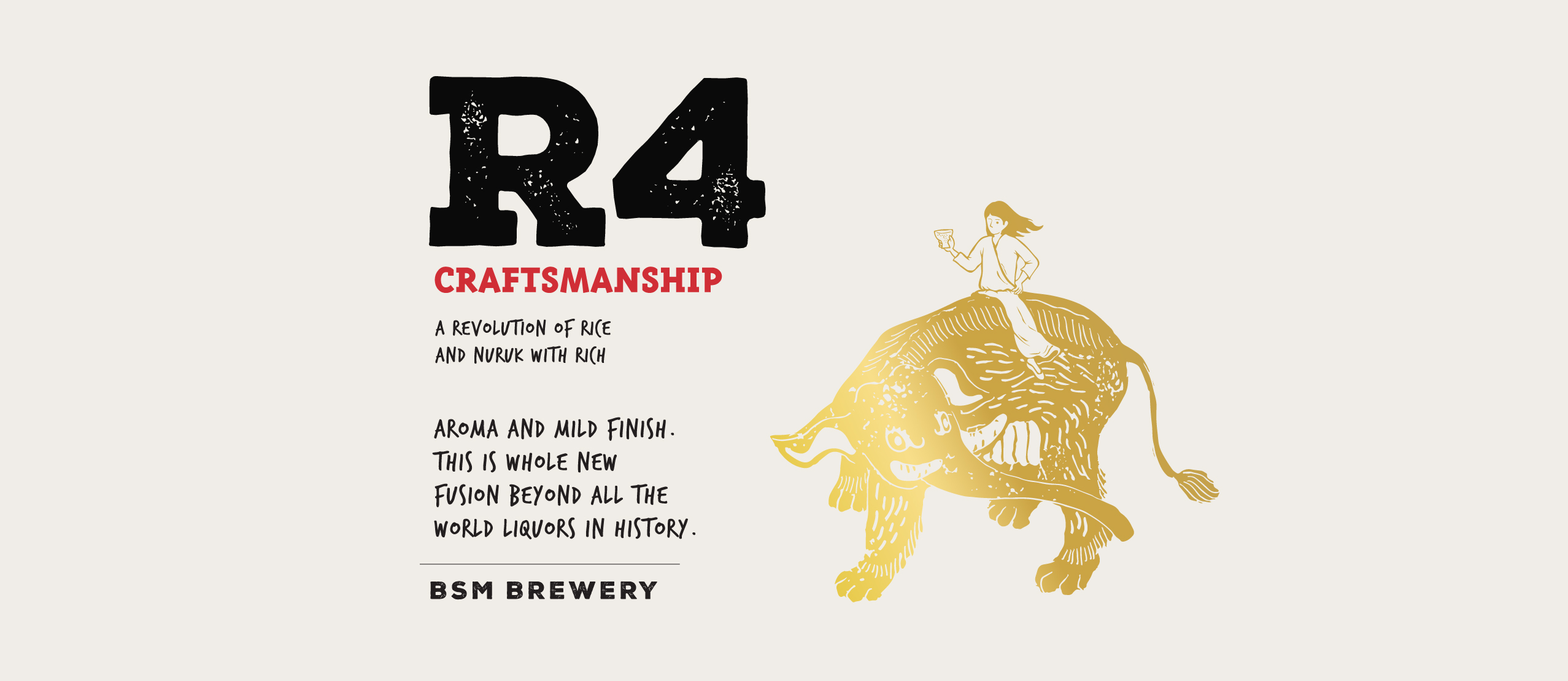
지난 20년간 배상면주가는 배씨문중의 양조 비법을 전승해왔다. 넘치는 자부심과 열정으로 전통 주류의 현대화를 실천해온 결과, 완전히 새로운 쌀 맥주인 "R4"가 개발 및 출시되었다. 작금의 변화하는 시장에서, 이 매혹적인 쌀 맥주는 그야말로 배상면주가의 계승자가 이룩한 통찰력과 혁신이라고 할 수 있다. 액션 서울은 이러한 혁신성을 강조하기 위해, 이제까지 그 어느 브랜드도 시도한 적이 없는 새로운 디자인의 술병을 선보였다. 짙은 갈색 병이 맥주의 정체성을 드러내는 한편, 전통적 술병에서 따온 빼어난 곡선은 맥주 효모를 활성화시켜 맛을 유지한다. 라벨 상의 신비한 동물은 실제로 동아시아 신화에서 사람들에게 술 빚는 법을 가르쳐 주었다고 전해지는 상서로운 생물이다. 한편, 굵은 손글씨 느낌의 폰트는 수제 맥주의 분위기를 전달하고 있다.
Over two decades, Bae&Brewing has inherited Bae family's secretive know-how of brewing liquor made of rice. They also have practiced the modernization of traditional liquor with pride and passion. After all, the whole new Rice Larger, "R4" was developed and launched. This fascinating rice beer was literally a symbol of the insight and revolution of the successors in the present varying and fast-changing market. To highlight their ground-breaking movement, action seoul came up with a whole new design, that any other brand has never tried before. While the brown bottle signalizes the identity of beer, the distinct curve of traditional bottle keeps the flavorful taste by activating the beer yeast inside. The mysterious animal on the label is actually an auspicious creature in East Asian myth that is told to have taught people how to brew wine. Also, the bold hand-written font gives the vibe of handcraft.


Client : Baesangmyeonjuga (주)배상면주가
-
Creative Direction : Jangsub Lee
Art Direction & Design : Minah Hong
Graphic Design : Yeonwoo Shin
Container Design : Seongyong Lee
Design Research : Koojong Kang, Hyeongyeong Kim, Deokwoo Kim
-
Portfolio Photography : Kiwoong Hong